Tips on choosing the perfect colours
When it comes to choosing the perfect colour scheme there are some key factors to consider: what feelings do you want to evoke? How do you want people to receive your room, your website or your appearance? What kind of message do you want to convey?
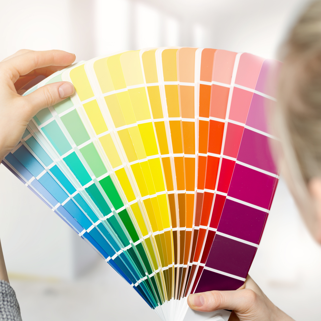
Colour has strong ties to memory and association, so choosing the right colour scheme is about more than what looks good; it has to end the right message. For example, the common theme in movie posters is to allow the colours of blue and orange to dominate because the orange excites potential viewers while the blue calm them, they balance each other nicely.

When it comes to crafting an outfit, a general rule of thumb is not to overdo it! if you are looking to introduce a variety of colours then three is the maximum number before it all starts to clash. When decorating a room in your home it is important first to note the room’s purpose; if the room is a living room for example and is used to lounge. Warm soft tones are best as they create a calming atmosphere. No one wants to get home from a long hard day of working under fluorescent lights to then collapse onto a sofa under some more fluorescent lights. To ensure a look and feel of cleanliness in a bathroom, tiles and walls are best kept classically crisp white, employing towels and decorative soaps, for example, to add a splash of colour.
Offices and workspaces should be engaging but not too distracting; colourful rugs or artworks against white walls or floorboards is a great way to introduce some interest in your workspace without confusion between it and other rooms that you would use for relaxing. Decorating a study and a living room the same way will cause most people to use these rooms in the same way. A great way to combat this is with a structured desk chair in the study and comfy cushions in the lounge room.

Some winning combinations that you can never go wrong with are contrasting colours; blue and orange, purple and yellow, pink and green. Red and green should only be put together during the festive season due to the strong association we have with this colour combination. Hence the reason why we rarely see these colours together at any other time of year.