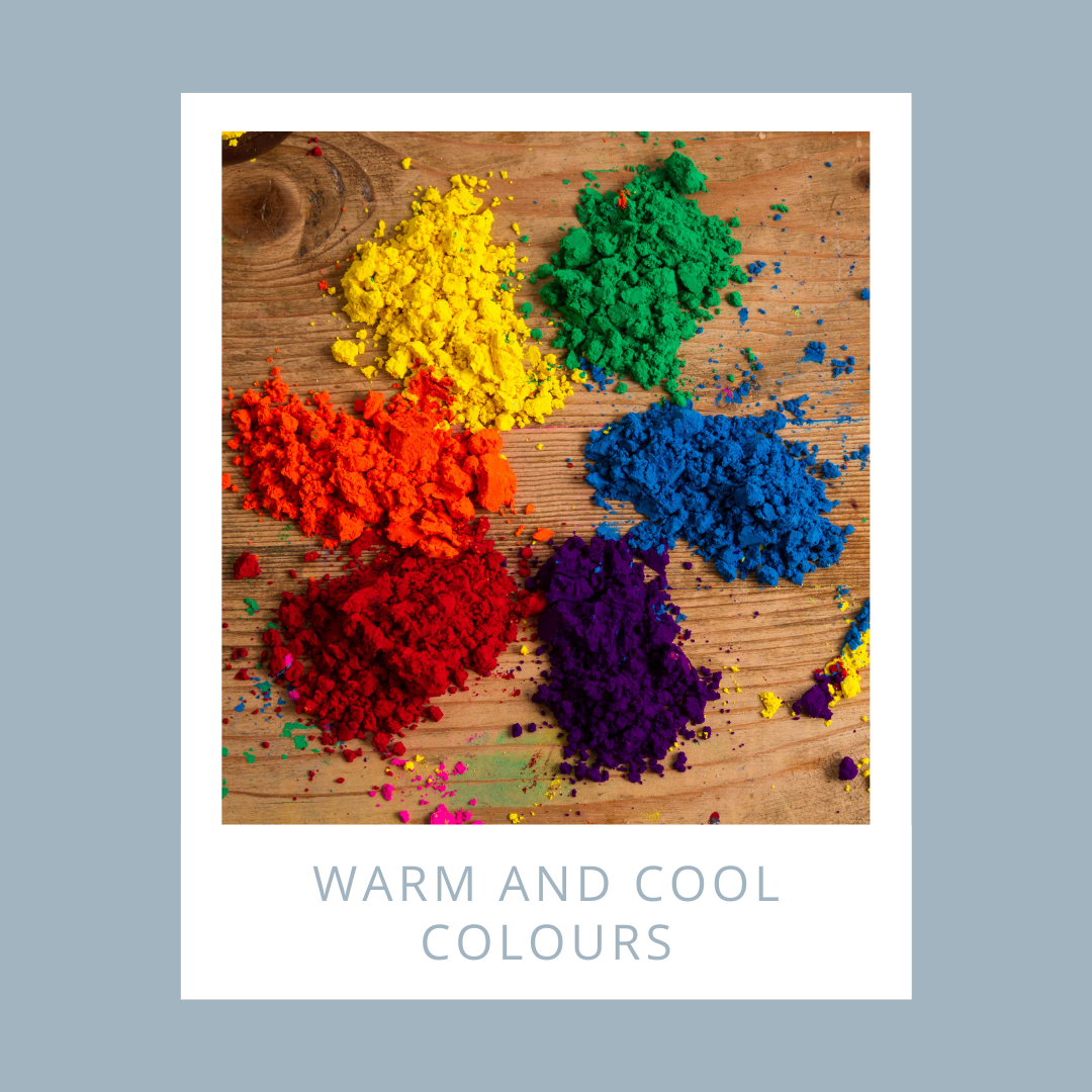
Warm and Cool colours
Share
Choices of colour and the relationships between colours have a huge influence on how a piece of art looks and feels and the emotions it provokes.
We are going to talk about how to use Warm and Cool colours and the difference between warm and cool colours that will help you when creating a colour scheme.

Colour Wheel Chart
Let’s start from the established colour wheel and from its so-called primary colours, such as magenta (red), yellow and cyan (blue), called primary as all the variety of other hues is achieved by mixing these three colours.
Colour wheel chart can help us to understand the general categories of warm and cool colours.
Isaac Newton developed the first circular diagram of colours in 1666. Since then scientists and artists have studied and designed numerous variations of this concept.

The colour wheel chart is divided into two main categories:
- warm
- cool
If you think about the warm colours associated with the sun, as a source of life and warmth for all. Warm colours are red, orange and yellow.
On the other hands, if we think of cool snowy mountains, for example, we get the cool hues: green, blue and violet.
Warm Colours
They go from yellow to red range reminding us heat and sunshine, intense emotions and passion, joy and playfulness. Think of the vibrancy of a bright orange or the intensity of a deep, rich red.
- Red-purple
- Red
- Red-orange
- Orange
- Yellow-orange
- Yellow

Cool colours
They sit on the blue, green range of the colour wheel, they are generally perceived as soothing and tranquil, they have the ability to create a sense of calmness, reminding us calming natural elements like water and sky. Their receding effect can even make you meditative, as though you are losing yourself in an endless blue sky.
- Purple
- Blue-purple
- Blue
- Blue-green
- Green
- Yellow-green
Tips for your interior
- Warm colours can be stimulating, so they are a great choice for social rooms and room that see a lot of activity such as living room, dining room and kitchen. They also attract attention and are generally perceived as energetic or exciting. As a feeling, they create a room cosy and full of positive energy.

- Cool colours are perfect for private rooms where important is concentration, tranquillity and rest like a bedroom, office and nursery. They are also great for small rooms you want to appear large, as they can make a small room bigger, full of positive energy.
Warm and Cool colours on paintings
Warm colours are said to advance towards you as if they are jumping out of the painting. These colours can be exciting and energetic and will catch the viewer’s attention by drawing their eye towards them.

Andy Warhol’s Cow (1966) was one of a series of brightly coloured prints used as a wallpaper design. Warhol deliberately used bright and unnatural warm colours. These strong colours advance and stand out so that they catch the viewer's eye when hung on a wall.
Cool colours are said to recede into the background, meaning that they move away from the viewer. Cool colours can be calming and relaxing but can also be used to signify sadness.

The Old Guitarist was painted by Pablo Picasso between 1903 and 1904, during his Blue Period. It features cool colours including dark blues, light blues, some turquoises and greens. The mood seems sad or even bleak. The only warmth comes from the brown of the guitar. This suggests a single source of comfort and warmth in the man’s life.
Warm and cool colours can be used together to create a sense of drama, to add interest and contrast, or to balance the temperature of a composition.

Arearea by Paul Gaugin in 1892, uses warm colours to evoke a sense of the hot, tropical climate of Tahiti. The unnatural colour choices help the viewer to gain a sense of the exotic location where Gaugin was painting in. Cool greens are used to balance the warm colours and make the idea of heat less intense.
Do you prefer warm or cool colours? or both?
Reference: art class curator and Moretti interior design
Pictures: Canva and pinterest
